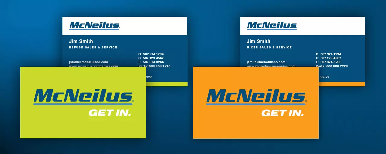
Rebranding McNeilus to Reflect the Customer’s World

It was time for McNeilus to shift from selling the product to “selling the house.” They needed a brand that stood for highly durable products, but also for the industry’s best support network. Their customers told us that no competitor’s post-sale service could stand up against McNeilus. So we created an updated brand with deep ties to the customer’s world.
In construction and sanitation, bright orange, green and yellow represent safety and close attention. So we blended those colors with an approachable, human voice to create a brand that resonates with the customer’s everyday experience.
At launch, we needed to tell audiences that McNeilus sees things differently. That they understand the importance of every customer’s job in a way only the customers themselves often do.
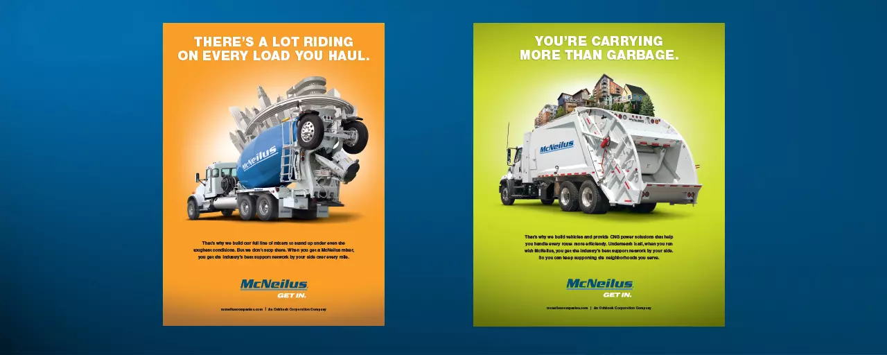
Refuse haulers carry more than garbage; they are responsible for the cleanliness and health of a community. And mixers have more riding on them than just concrete; they make it possible for infrastructure to be built and maintained. McNeilus communications now reflect this understanding—that the quality and maintenance of a vehicle impacts more than just a bottom line.
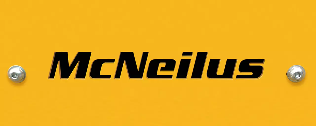
For a logo redesign, we found inspiration in the one place where end-users most often encounter the mark: as a stencil cut on the back of a truck. We based the new design on this stenciled variation to create a more contemporary look across all brand impressions.
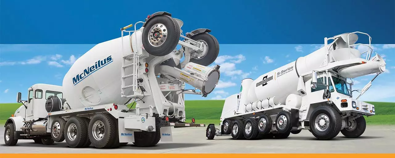
Today, all McNeilus ads, sales materials and other communications reflect a focused visual brand and message. Consistency like this is critical in establishing the brand’s market position for current and prospective customers. Now there’s no question about what McNeilus stands for: Strong products and strong support.