Portfolio

    A Place to Grow


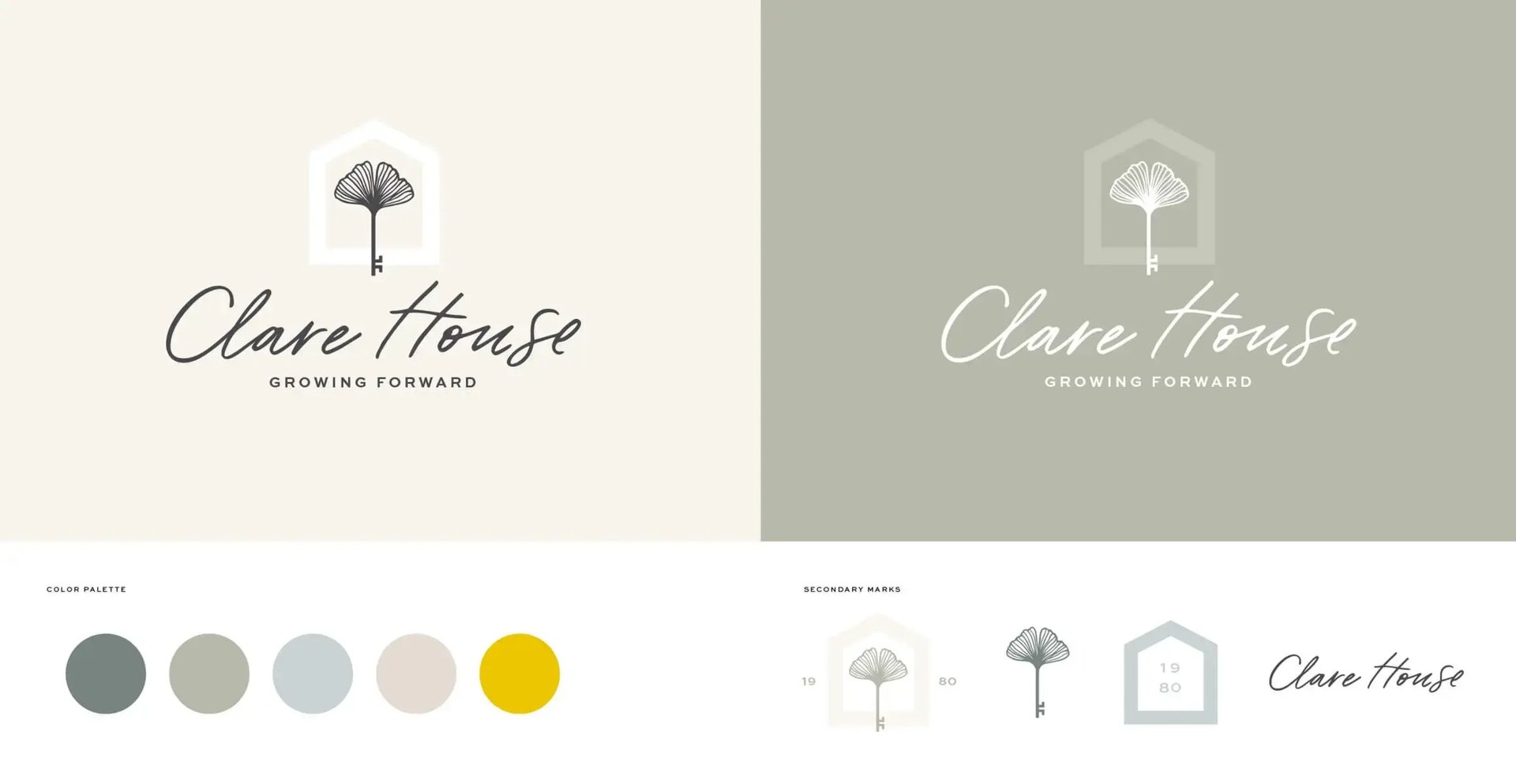
    Clare House brand identity featuring primary logos, a soft neutral color palette and secondary marks inspired by growth, shelter and support.

    Clare House is a transitional housing program for mothers and children facing homelessness to find safety, support and the respect they deserve. Through the use of comforting tones, approachable language and by showcasing their mission, Godfrey put comfort and empowerment front and center.

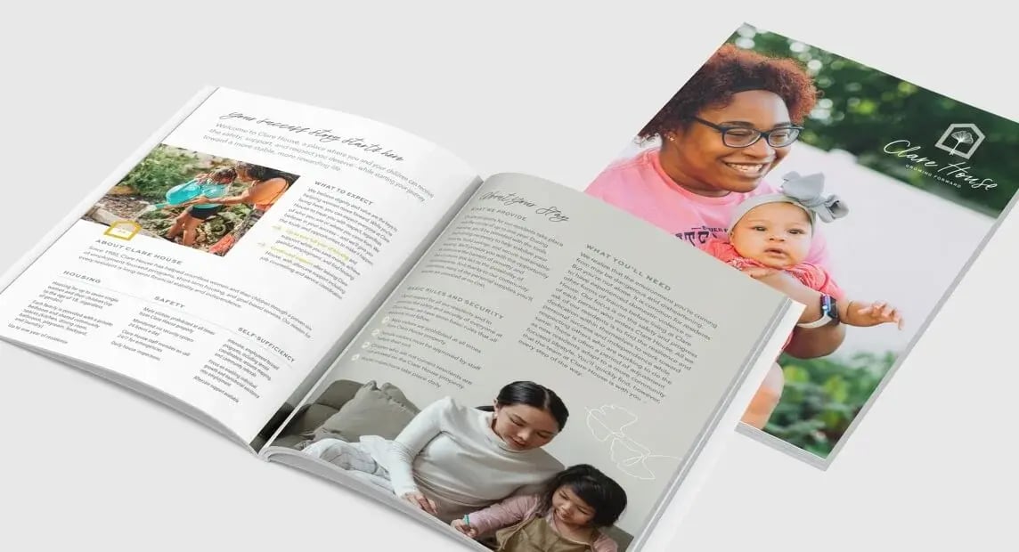
    Clare House printed brochure and informational materials featuring photography and resources for mothers and children experiencing homelessness.
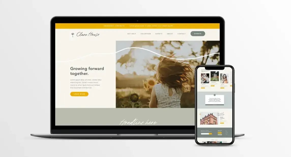
    Clare House responsive website displayed on a laptop and smartphone, featuring warm photography, supportive messaging and donation options.
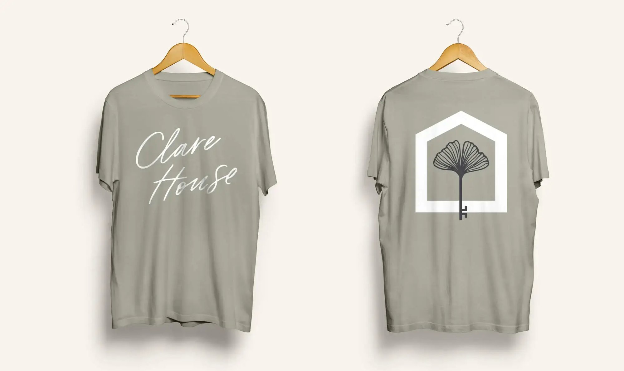
    • Front and back views of Clare House branded T-shirts featuring the organization’s wordmark and house-and-flower logo identity.
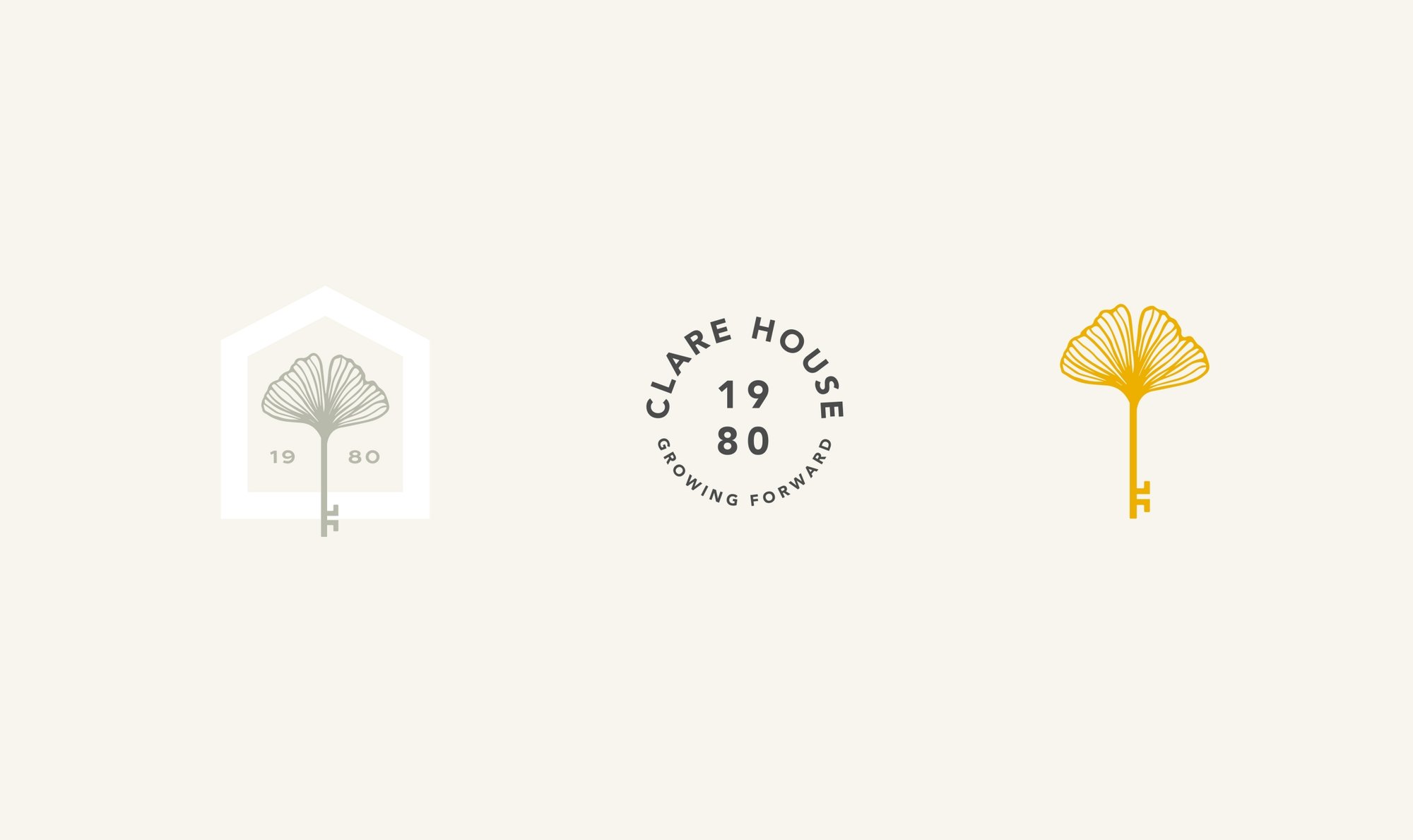
    • Clare House secondary brand marks feature a house and flower symbol, circular Growing Forward logo and a yellow flower shaped like a key.
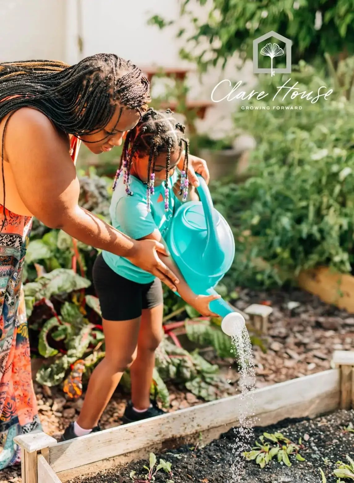
    Mother and child water a raised garden bed together beneath the Clare House logo and Growing Forward tagline in a warm outdoor setting.
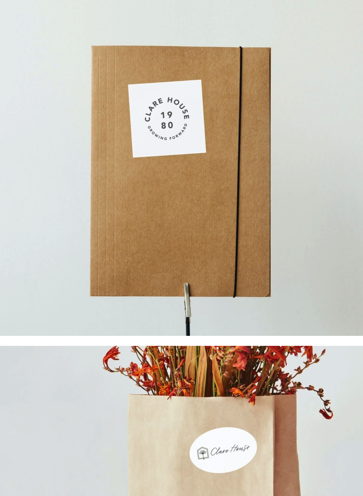
    Clare House branded folder and flower packaging feature natural kraft materials and the nonprofit’s refreshed logo designs

    TAKE THE NEXT STEP

    We’re an agency that knows what it takes to overcome the challenges B2B industries face. If you’re ready for marketing that really works, we are too.

    COPYRIGHT © 2026 GODFREY ALL RIGHTS RESERVED | PRIVACY POLICY