Google's Latest Update: Is Your Site Mobile-Friendly?

Google recently updated their algorithm for ranking sites in mobile search. Learn why it is so important to Google (and your customers) that your site is optimized for use on mobile devices.
Google recently updated their algorithm for ranking sites in mobile search. Why? Users on mobile devices are frustrated with websites that are not mobile-friendly, so they are immediately searching again in order to find a better mobile experience. This update is designed to provide those users with a more productive mobile search, showing mobile-optimized websites higher in search results. Since a majority of Google searches this year will occur on a mobile device, it’s clear that a customer’s mobile experience should be of high importance.
Businesses have anticipated this update with concern, and while “Mobilegeddon” has not had quite the upheaval everyone had feared, there were still plenty of prominent sites that saw a drop in rankings because their site wasn’t mobile-optimized. According to BrightEdge, there was a 21% decrease in non-mobile friendly pages listed on the first three pages of search results.
Now that two weeks have gone by—and Google is known to tweak their algorithms as they go—this is a nice reminder that good SEO is about user experience and writing targeted content that’s of interest to users and easy for search engine spiders to read.
Tips for a Mobile-Optimized Site
- Think mobile first, and start building from the smallest screen size (this is your basic iPhone, which has a 320 viewport).
- Consider that your users are tapping not clicking, so give them more space to tap on links and buttons by providing larger tap-size targets. Also, be sure you have tailored links and buttons to tap.
- Make sure your font size is readable on a small screen.
- Content needs to automatically size to the screen. Don't make people zoom in and out to see your content.
- Page loading speed is key, so make sure your images and code are optimized for pages to load quickly.
- Eliminate non-mobile-friendly technology like plug-ins and Flash.
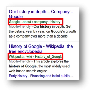
- Extra Credit: Google recently changed how they show a URL in the mobile search results. You will no longer see the URL; instead you will see the “breadcrumbs.” See example below. So, control what Google shows by adding page title and breadcrumb schema code to your site. The example below shows what this looks like in search.
Google and its Impact on Your Website
Not sure if your site, or a specific page, is mobile-optimized? The easiest way to find out is to log into your Google Webmaster account and locate the link for “mobile usability” under “Search Traffic.” Here, you’ll see all the pages that Google has crawled on your site and what issues are preventing you from getting that “mobile-friendly” label. To check a specific page, try Google’s mobile tool or, even better, search for the page on your mobile device—if it is mobile-friendly, it will have text saying so.
Why does Google care if your site is mobile-optimized? It isn’t just about making sure everyone has a good experience on the web. Google knows that if it wants to continue dominance in the search space and increase the money it makes in mobile search ads, it has to compete with new sites as well as apps. So, the happier a user is with their mobile search results, the more likely they will be to stick with Google.
You may be thinking, “My site is a B2B site and like most B2B sites, my mobile traffic is under 10 percent, so why do I care?” Chances are if you take a look at your analytics, you will see that this has been changing over the last year as audiences and their devices are shifting to be more smartphone- and tablet-based.
According to the IDG Global Mobile Survey 2014, mobile is preferred over the desktop for executives doing research both in the office and out of the office. This same survey showed that 72 percent of executives used their mobile phone to do research for business purchases. Over the last few years, I have seen less laptops at trade shows and more people getting work done on their phone or tablet. Because mobile phones are often used in research and trade shows are about those early stages, shouldn’t you make sure your site is easy for them to get that information? What about emails? Most emails are opened on a mobile device; what happens when they click on a newsletter link? Giving your user a better experience with your brand is only going to enhance your reputation with them.
Making your site mobile-friendly is not just about a better ranking in search. It’s also about providing targeted, relevant content with the intent of getting more sales and leads from the traffic you already have.
Sign Up for our Newsletter - Get agency updates, industry trends and valuable resources delivered directly to you.
Godfrey Team
Godfrey helps complex B2B industries tell their stories in ways that delight their customers.